Inter Font
Inter's canonical source is
rsms/inter. Google Fonts is a fallback distribution, not the authority for current Inter builds.
Design Position
| Field | Value |
|---|---|
| Design family | CSS and platform primitives |
| Use when | Use when browser-native UI behavior depends on Inter Font. |
| System map | Design System Map |
| Proof path | Browser support, progressive enhancement, responsive behavior, and reduced-motion/accessibility checks where relevant. |
Operating Rule
When a project intentionally chooses Inter, source it from Rasmus Andersson's official distribution: the GitHub release, the official CSS at https://rsms.me/inter/inter.css, or the inter-ui package. Treat Google Fonts as a convenience fallback only when the deployment environment makes the official route impractical.
This does not repeal the house design rule against defaulting to Inter as the whole personality of a product. It sharpens the rule: if Inter is the right neutral UI workhorse for a dense software surface, use the real source and configure it deliberately. If the product needs a point of view, audition type from Type Foundries Reference and Fonts — Picks & Free instead of reaching for Inter by habit.
Why The Source Matters
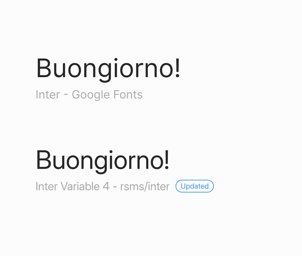
The bookmark corrected a common implementation mistake: using Inter from Google Fonts and assuming that means the project is using current Inter. The official README says Google Fonts should be used only when there is no other choice because that distribution can be outdated and lacks italics. Ana Howard's visual comparison shows different rendering between Google Fonts Inter and Inter Variable 4 from rsms/inter.

Version Snapshot
As of 2026-06-29:
| Surface | Current fact |
|---|---|
| Canonical repo | rsms/inter at https://github.com/rsms/inter |
| Default branch | master |
| Branch HEAD | 353b61b9f4430d5f420d56605a6e7993e0941470 |
| Latest GitHub release | v4.1, published 2024-11-16 |
| Release asset | Inter-4.1.zip |
| npm package | inter-ui |
| npm latest | 4.1.1, published 2025-06-22 |
| License | SIL Open Font License 1.1, with reserved font name terms |
| Repo status | About 19.7K GitHub stars on 2026-06-29 |
Versioning implication: social posts can flag that a distribution is wrong, but agents should still verify current release state from GitHub, npm, or the official site before changing implementation guidance.
Typeface Facts
Inter is a screen-first UI family with a tall x-height, broad language coverage, variable-font support, true italics, optical sizing, and OpenType features useful in software interfaces: contextual alternates, tabular numbers, slashed zero, fractions, and related numeric settings.
The official site describes Inter as a family with 2,000+ glyphs, support for 147 languages, weights from 100 to 900, and dedicated designs across text and display usage. The important implementation detail is optical size: smaller text needs clarity, spacing, and ink-trap behavior; larger display text can use smoother curves and more delicate details. Pair this page with Variable Fonts 2026 when wiring axes and performance budgets.
Implementation Notes
Use Inter when anonymous software neutrality is a feature: dashboards, agent consoles, internal tools, dense product surfaces, documentation UIs, and components where the typography should disappear behind the work. Do not use it as a substitute for brand thinking.
Preferred route:
@import url("https://rsms.me/inter/inter.css");

:root {
  font-family: Inter, ui-sans-serif, system-ui, sans-serif;
  font-feature-settings: "tnum" 1, "zero" 1;
  font-optical-sizing: auto;
}
For production systems, self-host and subset the release files when performance or privacy matters. Keep font-display, fallback metric overrides, and unicode-range splitting in the same review as the font choice. If using npm, pin inter-ui and check its version against the GitHub release.
Agent Guidance
- If a repo uses
fonts.googleapis.comfor Inter, flag it as a source-quality issue and suggest official Inter distribution unless the project has a deployment constraint. - If the task is "make this UI look better", do not solve taste by swapping to Inter. Start with layout, hierarchy, density, spacing, states, and a real type choice.
- If Inter remains the right choice, use the current official source, enable the numeric and optical settings the UI needs, and document that decision in the design system.
Timeline
- 2026-07-01 | Design category refresh added this page to the CSS and platform primitives family, linked it to Design System Map, and kept it standalone because Inter Font owns a distinct design decision surface in this family. Source: User request, 2026-07-01
- 2026-06-29 | User corrected the Inter source: "THIS IS THE REAL INTER" refers to
rsms/inter, not Google Fonts. Promoted the Ana Howard bookmark and self-thread repo artifact into this canonical page; inspected both local images and verified GitHub/npm release state. Source: User correction, 2026-06-29; X/@AnaArsonist, 2026-06-26; GitHubrsms/inter; npminter-ui